Every TV Show and Movie That Uses Periodic Table Element Typography
The Design That Escaped Television
In our previous article on Breaking Bad's chemistry, we covered how Breaking Bad turned two element symbols into the most recognizable title card in television history. But the show did something bigger than branding itself. It created a visual language -- periodic table element typography -- that spread far beyond a single AMC drama.
This is a survey of every TV show, movie, video game, music artist, and brand that has borrowed, adapted, or been inspired by the element-tile text style. Some are direct homages. Some arrived independently. All of them prove that the periodic table has become a design tool as much as a scientific reference.
Television: Where It Started
Breaking Bad (2008-2013) -- The Origin
The anchor. Breaking Bad used Bromine (Br, element 35) and Barium (Ba, element 56) embedded directly in the title, rendered in a green-on-black periodic table tile style. The design extended to episode title cards, promotional posters, and merchandise. It was not the first time someone highlighted element symbols inside a word, but it was the first time tens of millions of people saw it happen every week for five seasons.
If you have not already, try spelling WALTER with real elements -- Tungsten, Aluminum, Tellurium, and more. Seven out of eight major characters can be spelled. Only Jesse is locked out, because no element contains the letter J.
Better Call Saul (2015-2022) -- The Prequel Carries the Torch
Better Call Saul inherited the element typography directly. The title card uses the same treatment: chemical element symbols highlighted within the show's name. The most obvious candidates are S (Sulfur) in "Saul" and Au (Gold) hiding inside the name itself -- SAUL spells out as S + Au + Li (Sulfur + Gold + Lithium). Gold sitting in the middle of a con man's name is the kind of detail that feels intentional whether or not it was.
The show's marketing leaned into the chemistry aesthetic throughout its run. Season posters, social media assets, and even the official website used element-tile styling as a visual bridge between Saul Goodman's story and Walter White's. It worked because the audience already understood the visual vocabulary -- Breaking Bad had taught them.
El Camino: A Breaking Bad Movie (2019) -- The Film Extension
When Netflix released El Camino, the promotional materials returned to the element-tile well. The film's marketing highlighted element symbols in character names and taglines, maintaining visual continuity with the series. Jesse Pinkman's name still cannot be spelled with elements -- that J remains an impassable barrier -- but the film's title itself contains El which maps to no standard element symbol, making it an interesting case where the aesthetic was applied even when the chemistry did not perfectly align.
Other TV Shows With Element-Adjacent Aesthetics
Several other series have flirted with science-themed typography, though none as committed as the Breaking Bad universe:
- Fringe (2008-2013) used a periodic-table-inspired visual style in its title sequences, with individual letters styled as element tiles during the show's science-themed intros.
- The Big Bang Theory (2007-2019) occasionally used element-styled graphics in promotional materials, leaning on the show's physics-and-chemistry-nerd identity.
- Scorpion (2014-2018) and The Flash (2014-2023) used science-flavored typography in their branding, though they stopped short of actual element symbol integration.
None of these shows made element typography central to their identity the way Breaking Bad did. The distinction matters: using a beaker in your logo is science theming. Embedding real element symbols inside your title is element typography. Breaking Bad did the latter, and that specificity is what made it iconic.
Film Beyond the Breaking Bad Universe
Element-tile typography has shown up in film marketing beyond Vince Gilligan's world, though often as a one-off design choice rather than a core identity:
- The Martian (2015) used chemistry-forward marketing that included periodic table references, fitting for a film about a botanist surviving on Mars through applied science.
- Flubber (1997) and other science-comedy films have occasionally styled their titles with laboratory aesthetics, though true element-symbol embedding is rare.
- Independent and student films with chemistry themes regularly adopt the Breaking Bad element-tile look for their posters -- search any film festival circuit and you will find at least a few.
The pattern is consistent: when a film wants to signal "this is about science" in a single visual, the periodic table tile has become the default shorthand. Breaking Bad made that association so strong that it functions as an instant genre marker.
Video Games and Interactive Media
The gaming world has its own relationship with element-tile aesthetics:
- SpaceChem (2011) and its sequel SpaceChem: 63 Corvi built their entire visual identity around periodic table elements, using element tiles as core gameplay components. Players literally manipulate element symbols to solve puzzles.
- Minecraft: Education Edition includes a Chemistry Resource Pack that renders elements as interactive tiles, directly borrowing the periodic table grid layout for its crafting system.
- Kerbal Space Program mods and Oxygen Not Included use element-inspired UI elements, recognizing that their player bases overlap heavily with science enthusiasts who appreciate the reference.
- Fan-created content for games like Fallout (with its retro-science aesthetic) frequently uses element-tile styling in custom artwork and mod interfaces.
The interactive medium adds something film and TV cannot: you get to manipulate the elements yourself. That is exactly what Spellement's spell tool does -- type a word, see the element breakdown, interact with each tile.
Music Artists and Album Art
Musicians and bands have occasionally adopted element-tile typography, particularly in genres where science imagery carries cultural weight:
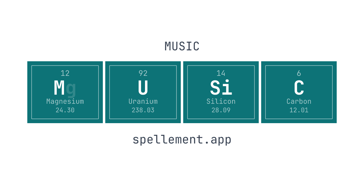
- Iron Maiden -- while the band does not use element-tile styling, fan communities have created element-tile versions of the band's name: IRON spells as Ir + O + N (Iridium + Oxygen + Nitrogen). The band name is a clean, full-match spelling.
- Nickelback -- the band name contains Ni (Nickel, element 28), and fans have pointed this out relentlessly. Whether you consider that a feature or a bug depends on your feelings about both the band and chemistry.
- Cobalt, Bismuth, and other metal/post-metal bands chose their names directly from the periodic table, and their album art often incorporates element-tile aesthetics as a natural extension of the name choice.
- Hip-hop and electronic artists have used element-styled text in album covers and tour visuals, particularly when the aesthetic fits a "breaking bad" cultural reference -- the show's influence on music visual culture is well-documented.
Brand Logos and Commercial Design
Outside entertainment, element-tile typography has become a staple in certain commercial niches:
- Science education companies use element-tile styling almost universally. Textbook covers, educational poster companies, and STEM toy packaging all borrow the format. It is the visual equivalent of saying "this product is about science."
- Etsy and custom gift shops represent the largest commercial application. Search "periodic table name art" and you will find thousands of sellers offering personalized element-tile prints for names, phrases, and quotes. This is a direct descendant of the Breaking Bad aesthetic, now a cottage industry. Check out our name spelling guide to see how the chemistry works behind those prints.
- Craft breweries and distilleries occasionally use element-tile styling for brands with chemistry-themed names. Breweries named after elements (Argon Brewing, Neon Brewing Co.) use the tile format in their tap handles and labels.
- University chemistry departments have widely adopted the style for department merchandise, recruitment materials, and event branding. The periodic table tile has effectively replaced the Erlenmeyer flask as the default "chemistry department" visual.
Why This One Design Took Over
The periodic table tile works as a typographic device for a specific reason: it is both constrained and universal. The constraints -- only 118 symbols, fixed format, real scientific meaning -- give it credibility. The universality -- every word is made of letters, and most letters appear in at least one element symbol -- gives it broad applicability.
Not every word can be spelled with elements. The letters J and Q appear in zero element symbols, making names like Jesse or Quentin impossible to render. But the vast majority of common names and words can be spelled, especially when you use partial emphasis -- highlighting just one letter of a two-letter element symbol.
That balance between constraint and possibility is exactly what makes element typography satisfying. It feels like a puzzle with a real solution, not a gimmick with no rules.
Try It Yourself
Every example in this article -- from WALTER to SAUL to IRON -- was verified using Spellement's spelling algorithm. The spell tool runs the same process instantly: type any word, see every valid element combination, pick your favorite, and export it as an image.
Breaking Bad proved that element typography works as a design concept. Better Call Saul proved it could sustain across a franchise. The thousands of Etsy shops, video games, album covers, and brand logos that followed proved it has staying power beyond any single show.
The periodic table has been around since 1869. Element typography, as a recognized design genre, has existed since 2008. That is 157 years of chemistry, distilled into a visual language that anyone can use. Spell your name, your band, your brand, your favorite word -- the elements are already there, waiting to be highlighted.